← @_ Twitter archive

Dave

@_

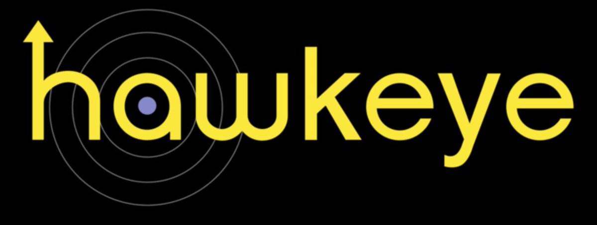
It's too easy to criticize logos, but what's amazing to me is the contrast between the amazing Thor logo & this Hawkeye logo, which would have been the first thing I tried in community college before the prof told me to just keep sketching.

7/22/2019, 9:44:52 AM

Favs: 6

Retweets: 0

Dave

@_

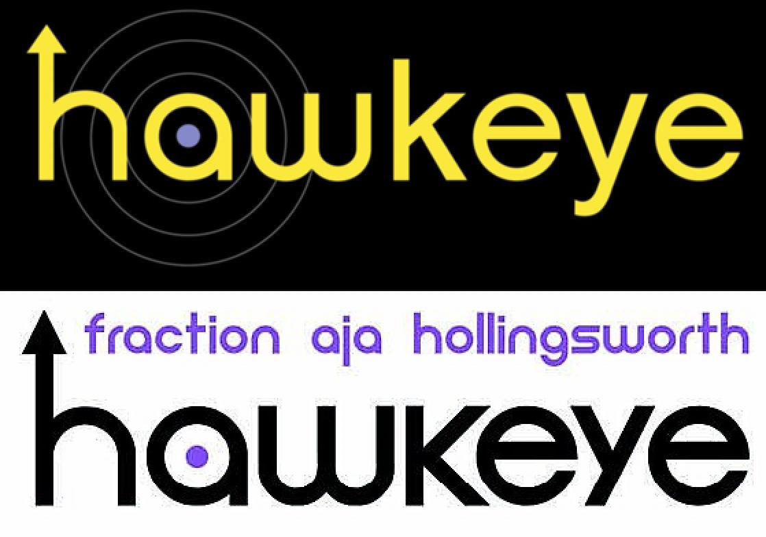
As people pointed out, this is clearly meant to evoke the logo from one series of the comic book, but again it looks thrown together (like someone just used the same font). Check out the (much worse) k & y - not at all cradling the e as in the comic book:

7/22/2019, 11:31:45 AM

Favs: 3

Retweets: 0